This portfolio highlights hands-on data projects using tools like R, SQL, power BI and Excel. Each section includes a real-world problem, the tools used, and key insights visualized for impact.
Explore how The Datavera Inc. uses dashboarding, GIS, and forecasting tools to support data-driven telecom operations in Africa and beyond.
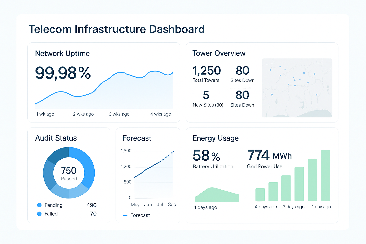
📊 Telecom Infrastructure Dashboard Overview
Demo Visualization – Client Data Upon Engagement
This sample dashboard showcases how remote data analytics can enhance telecom infrastructure management. Key performance indicators (KPIs) such as tower uptime, audit scores, and energy consumption are visualized in real-time, enabling operations teams to monitor performance and respond proactively to outages or inefficiencies.
It also features a basic forecast component to help predict maintenance needs and optimize resource allocation.
Key Insight:
Real-time tower uptime and energy data provide operators with a high-level view of network reliability and performance.
Recommendation:
Prioritize tower audits in regions with lower uptime scores and automate monthly performance tracking for better operational efficiency.
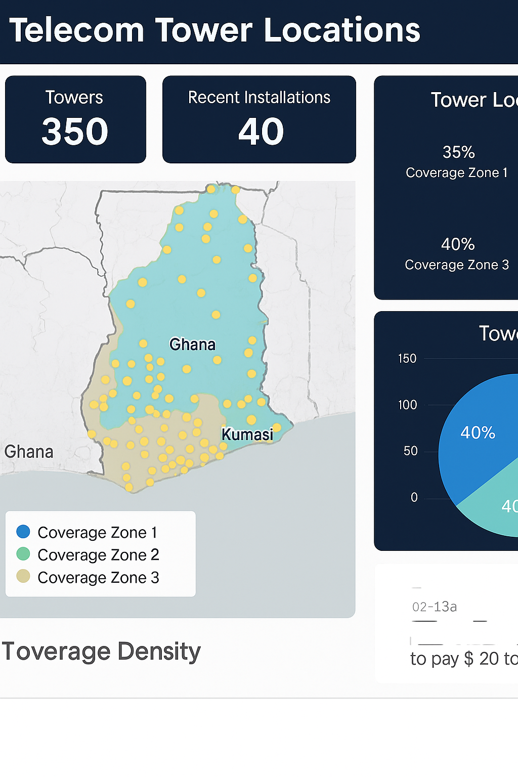
🗺️ GIS Dashboard for Telecom Infrastructure
This Geographic Information System (GIS) dashboard visualizes the distribution of telecom towers across regions such as Ghana, Côte d’Ivoire, Togo, and Benin. It features color-coded coverage zones, tower density metrics, and regional insights for infrastructure planning. With integrated pie charts and bar graphs, this dashboard offers a powerful way to support site acquisition, network expansion, and compliance reporting across West Africa.
Key Insight:
Tower density and coverage maps reveal high-capacity zones and underserved areas across West Africa.
Recommendation:
Use spatial insights to guide new tower placements, improve service equity, and align with regional expansion goals.
Demo Visualization – Client Data Upon Engagement
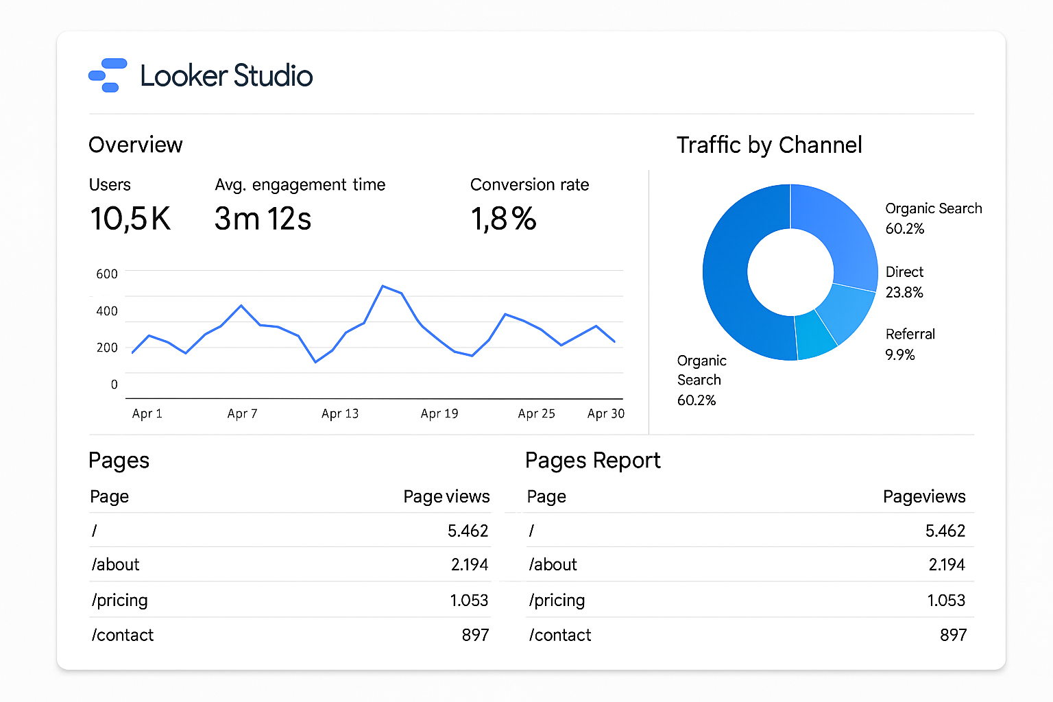
📈 Looker Studio Dashboard for Website Analytics
Demo Visualization – Client Data Upon Engagement
This Looker Studio dashboard provides a real-time overview of web performance metrics. It highlights key indicators such as user sessions, top traffic channels, and most-viewed pages — all displayed through clean visualizations like line graphs, pie charts, and performance tables. This type of reporting helps teams monitor marketing campaigns, track audience behavior, and make data-driven decisions based on live traffic data.
Key Insight:
Traffic channels and page views show where user engagement is strongest and how visitors navigate your digital content.
Recommendation:
Optimize content around top-performing pages and set up event tracking to convert more traffic into actionable leads.
📊 Forecast Dashboard – Telecom Infrastructure (Ghana, Uganda, South Africa)
This telecom infrastructure forecast dashboard provides visual insights into key operational metrics such as active towers, forecasted utilization, and projected revenue. The design includes monthly performance trends, regional comparisons, and a map displaying tower distribution by country
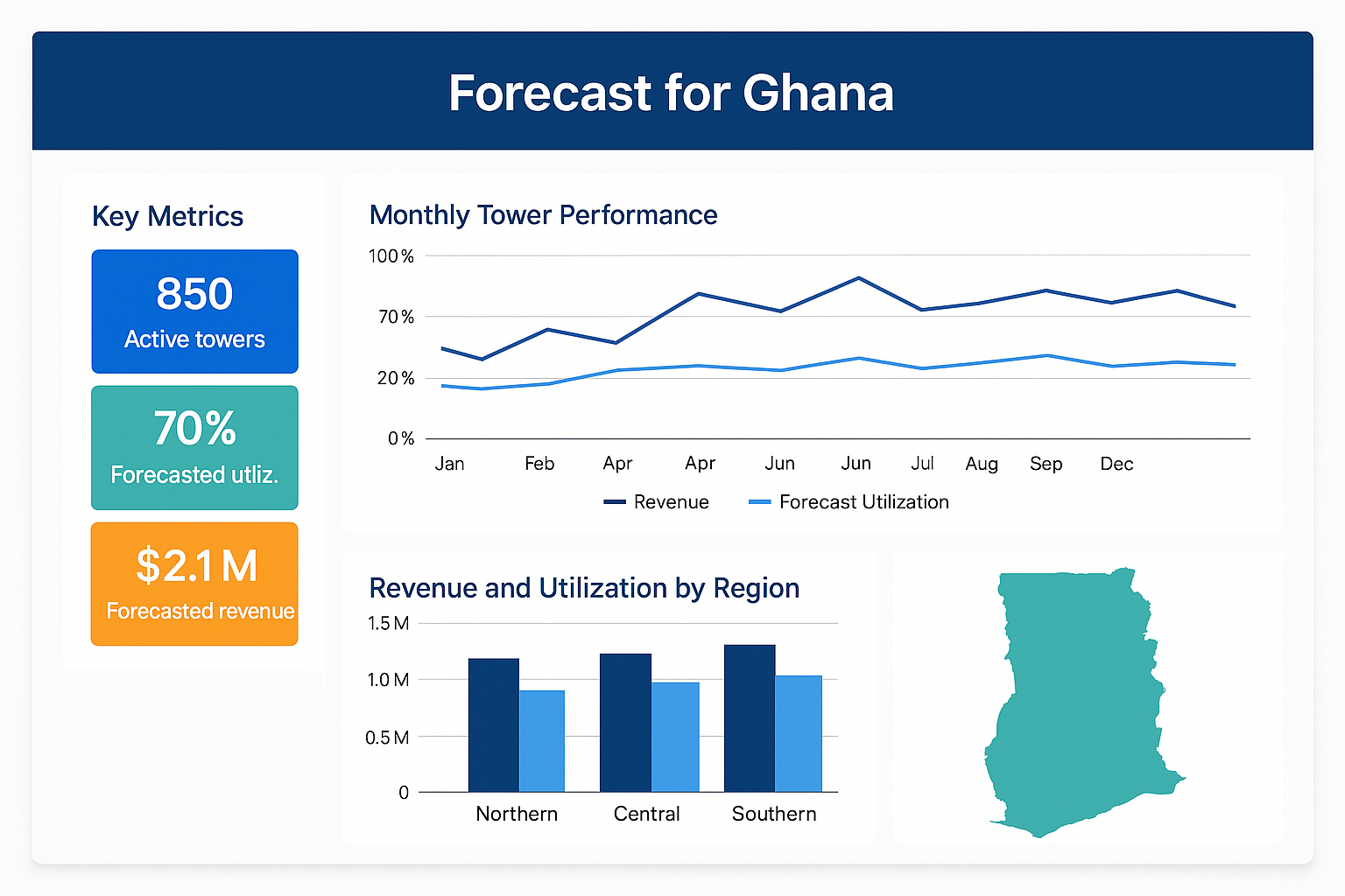
Forecast dashboard showing Ghana’s tower operations, including monthly performance trends, revenue forecasts, and regional tower distribution.
Demo Visualization – Client Data Upon Engagement
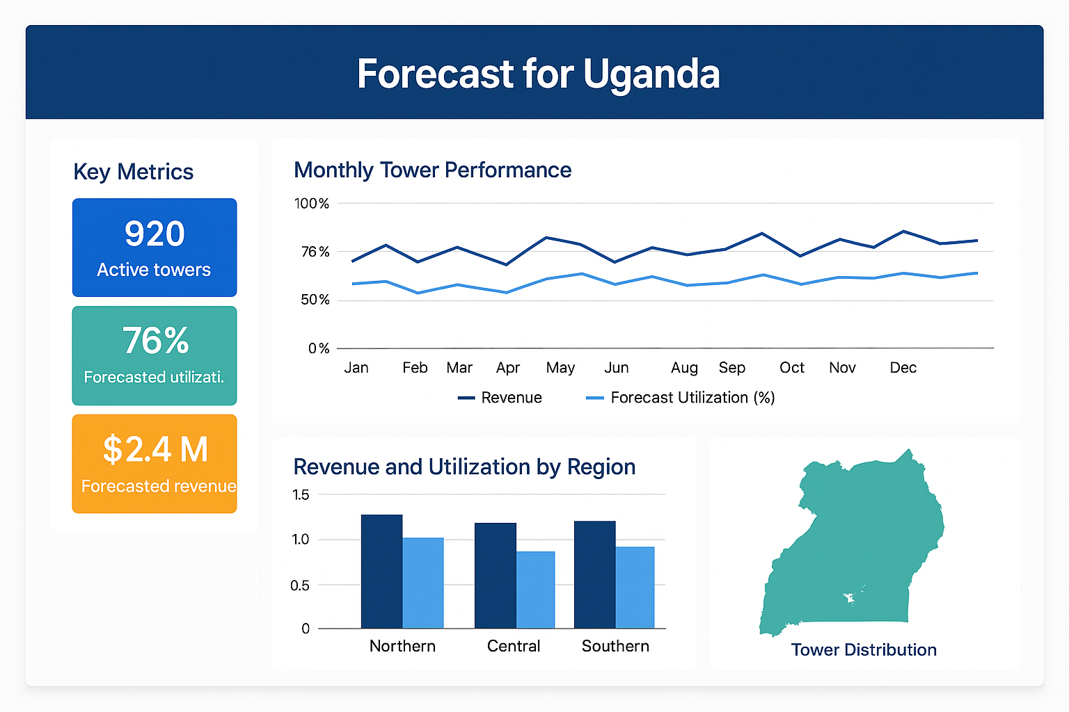
Uganda-focused dashboard presenting active tower count, utilization forecasts, and revenue insights with a regional breakdown.
Demo Visualization – Client Data Upon Engagement
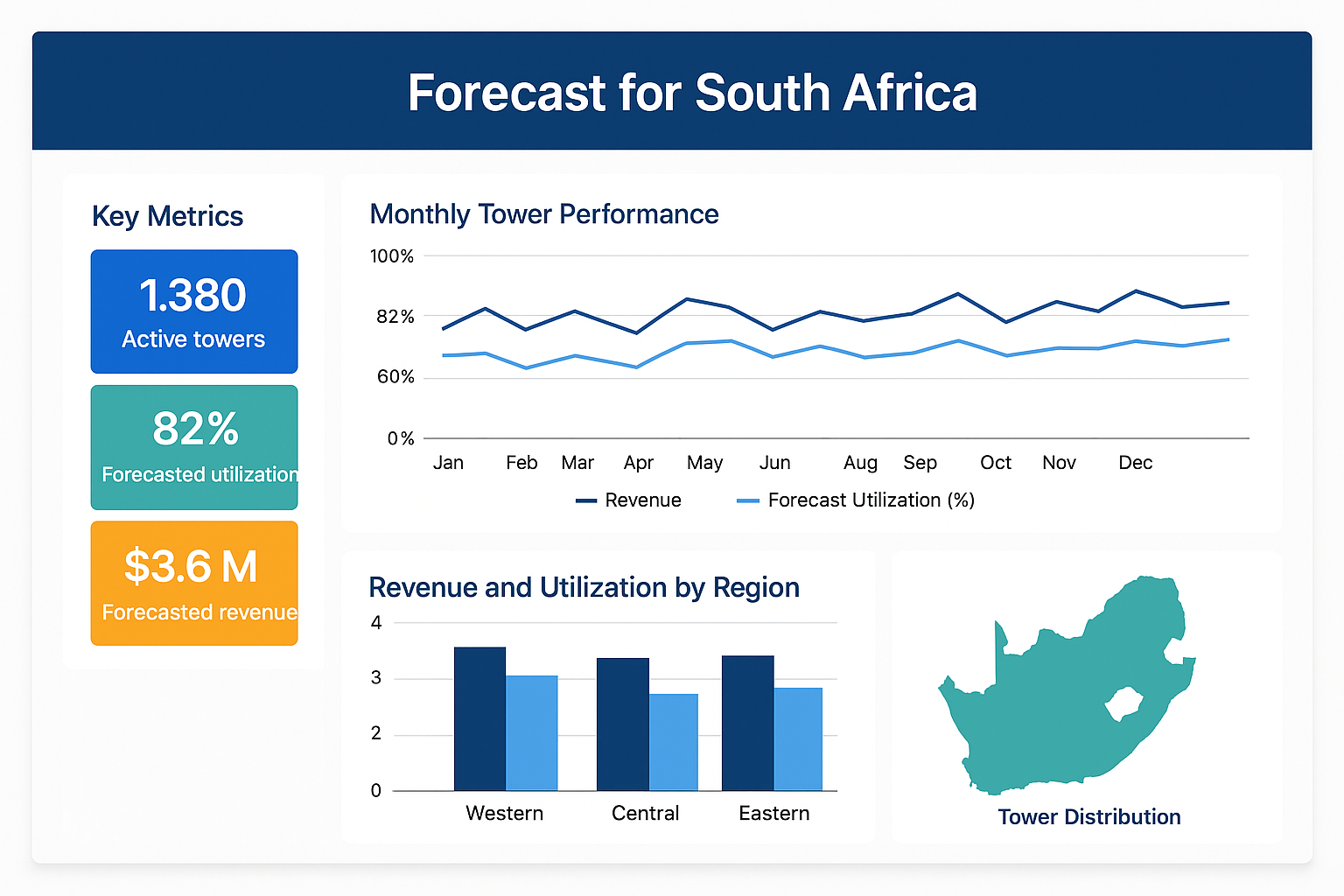
Comprehensive telecom dashboard highlighting South Africa’s infrastructure trends, tower activity, and performance forecasts by region.
Demo Visualization – Client Data Upon Engagement
dashboard – tableau
Introduction:
This project demonstrates how structured data from a fictional retail dataset was analyzed using SQL to uncover business insights. The focus was on identifying top-performing products, analyzing profit margins across categories, and spotting regional trends in sales performance. Through SQL queries, I efficiently filtered, grouped, and joined data tables to produce actionable insights that can support strategic business decisions. This project showcases my ability to work with relational databases, extract meaningful metrics, and communicate findings effectively.
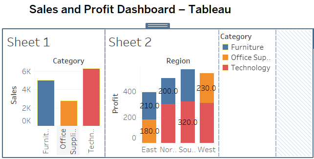
Summary of Data & Insights
This project visualizes sales and profit data across regions and product categories. The goal was to surface actionable insights for optimizing sales strategy, inventory decisions, and marketing focus.
Key Insights:
· Western region leads in sales, Southern region leads in profitability.
· Technology is the top-selling category, but Office Supplies offers higher margins.
· Sales spikes during specific quarters suggest opportunities for seasonal campaigns.
Challenges:
- Cleaning raw data for Tableau compatibility
- Designing a layout that communicates both sales trends and profit breakdowns clearly
- Creating filters that allow stakeholder-level interactivity
Value Delivered:
- Created a visually intuitive dashboard that allows sales and marketing teams to explore performance by region and category
- Delivered actionable insights that help stakeholders plan promotions and inventory strategy
Marketing Performance Analysis (Email, Social & Ads)
This analysis presents a clear, visual representation of a multi-channel marketing campaign spanning five months. The goal was to monitor user engagement and conversion across three primary digital channels: Email, Social Media, and Online Ads.
Objective:
To track the effectiveness of each marketing channel in driving user actions, specifically clicks (interest) and conversions (action), and evaluate trends that could guide future strategy.
Key Insights:
- Consistent Growth: All three channels saw a steady increase in both clicks and conversions from January to May.
- Highest Engagement: Ads consistently drove the highest number of clicks and conversions, making it the top-performing channel.
- Email Efficiency: While Email had fewer clicks, it maintained a healthy conversion rate—suggesting more qualified leads.
- Social Media’s Role: Strong mid-tier performer with balanced growth, indicating successful audience targeting and engagement.
Visual Interpretation:
- Solid Lines represent Clicks for each channel.
- Dashed Lines represent Conversions, tracking how effectively interest translated into action.
- The chart makes it easy to detect dips (like in March for Email) and surges (like Ads in April/May), which are useful for performance reviews and campaign timing.
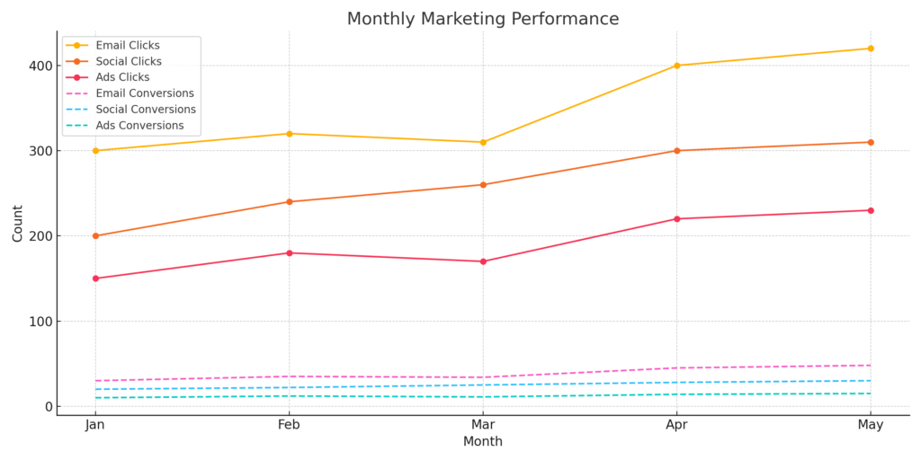
Conclusion:
This dashboard illustrates how data visualization helps in evaluating the return on marketing investments. By aligning efforts with months of higher engagement, teams can optimize campaigns, allocate budgets wisely, and drive meaningful growth.