Telecom Infrastructure Analytics with Power BI – Improve Uptime & Reduce Operational Cost
These scenarios illustrate what The Datavera Inc. can deliver through data-driven insight and forecasting.
Industry Focus: Telecom Infrastructure
Service Modeled: Predictive Maintenance Dashboard + Monthly Reporting
Engagement Type: Subscription-based analytics (hypothetical scenario)
Context
This example illustrates how The Datavera Inc. could apply predictive analytics to improve operations and reduce costs for a telecom infrastructure provider operating across rural sites in Africa or similar regions.
Approach
Using historical maintenance data, climate trends, and tower performance records, The Datavera Inc. would implement a remote dashboard to forecast outages and high-risk towers.
Key Deliverables:
– Monthly infrastructure risk heatmaps
– 72-hour tower performance forecast
– Weekly email alerts to field managers
Expected Results (Based on Industry Benchmarks)
– Downtime reduction potential: 30–40% within the first 90 days
– Proactive field deployment, reducing emergency dispatches
– Estimated monthly cost savings: $4,000–$5,000 depending on tower density
– Forecasted ROI: 300%+ based on comparable analytics interventions
Note
This case study represents a modeled scenario designed to show the practical value of our subscription-based analytics services. It is not based on a past client project, but reflects real-world analytics potential informed by our methodology and sector research.
Featured Dashboard: Power BI for Telecom Infrastructure Optimization
A high-level Power BI dashboard summarizing key performance indicators across telecom tower sites — including uptime, cost per tenant, and regional performance.
A real-world dashboard showcasing:
- Cost per Tenant per tower
- Uptime Score calculated from live metrics
- Interactive filtering by region, uptime thresholds, and timeline
- Color-coded performance indicators to highlight critical sites
This dashboard was built in Power BI as part of our internal analytics training and is a sample of our capabilities in translating raw operational data into actionable insight.
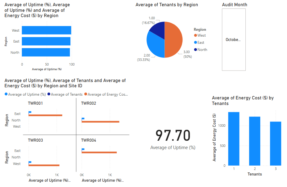
Dashboard 1: Tower Audit – Site Efficiency & Cost per Tenant
Analyze operational cost efficiency by calculating energy cost per tenant per site, helping identify areas of financial optimization.
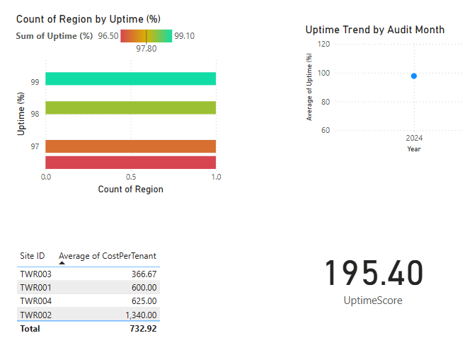
Dashboard 2: Uptime Score – Measuring Regional Network Reliability
This custom measure multiplies uptime by tenant count, providing a composite efficiency score for each telecom tower.
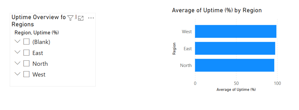
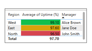
Dashboard 3: Interactive Filtering – Exploring Regional Uptime & Performance
Use interactive slicers and filters to explore uptime performance by region, tower, or manager, enabling dynamic analysis.
Dashboard 4: Time-Series Trends – Monthly Network Performance in Power BI
Visualize how tower uptime changes over time using time-series analysis. Ideal for spotting patterns or anomalies month over month.

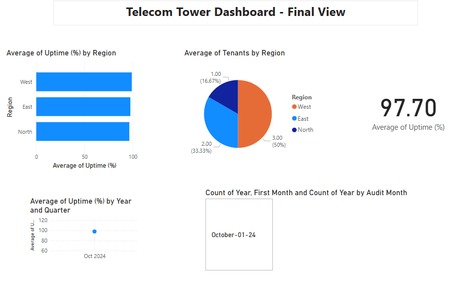
Dashboard 5: Enhanced Visualization – Clean Layout, Color Logic & UX Polishing
A polished and interactive dashboard combining calculated columns, custom measures, and filters for a complete performance view.
Dashboard 6: Manager & Region Mapping – Power BI Data Model with Multiple Sources
Demonstrates Power BI’s data modeling by linking tower performance with manager assignment and regional structure.
🔍 Business Insight Summary: Key Performance Highlights from Across Dashboards
This use case illustrates how The Datavera Inc. applies a dual approach—leveraging both predictive analytics and interactive dashboards—to optimize telecom infrastructure performance. Through Power BI visualizations, we showcase metrics such as Cost per Tenant, Uptime Score, and time-based performance trends. These insights help identify inefficiencies, benchmark regional operations, and support data-driven decisions. Combined with forecasting models, this approach empowers telecom providers to anticipate demand, allocate resources more effectively, and maintain high network uptime—ultimately enhancing operational resilience and customer satisfaction.
